

Yes I know, if you are reading this article it means that you don’t feel like an amazing food photographer yet.
Let’s recap, you consider yourself a good photographer, your food looks great, your camera is a professional one, you even read some tips for food photographers, you do everything right but, despite that, your pictures are still soulless!
Fuck! Let’s go see what you’re doing wrong!
I’m sure the reason is that your photos are missing something in the composition, I really believe that you didn’t consider that in food photography the set has the same importance as the food to be photographed!
Maybe that’s the reason for your disappointment…
Before you lose your confidence and put yourself on the same level of a 15-year-old girl who take selfies with a portion of french fries in the hand, let’s analyze a few things better.
First of all I need to mention that food photography is one of the hardest genres in the field, there are many variables to consider.
Dishes, plates, glasses, ingredients, etc. All important accessories for taking a good photograph, but there are important elements that will give character to our shot. Do you know what?
Simple, my green Italian eye!
Ahahahah Did you fall there? No? I imagined!
Seriously, I’m talking about Background props for food photography! They will give our photography an edge!
It is essential to create a set around the product, styling is the photographer’s signature. We have to be different from other photographers! it’s like writing lovely words to wonderful music, mmm when I write these pearls of wisdom I am almost moved! ahahah
Now that we have a clear point of view, all the other accessories will be easier to add and put on the set.
Absolutely we must start from a careful analysis of the subject, in this way we could understand which are the best backdrops to use. We don’t have to fail this important first step!
Working for a company, for a chef, for a friend or for ourselves, the rules doesn’t change! Our picture must convey a message, it must to exhibit what there are behind that food!
Sometimes we have to make to someone taste a flavor, sometimes show a place, sometimes enhance the character of a chef, sometimes we will have to talk about innovation and other times traditions!
Are you worried about not being ready? Well, it will mean that I will have less competition!
– The food
First of all, we must study the main subject in-depth, it is a priority for the construction of our photographic set. Know the origin of the food, who made it, who will eat it, and obviously what ingredients it is made of. Well, now let’s see how to make an assessment and identify the most important details.
– Appearance
Let’s start by considering the external aspect, but also the internal one.
The color, the brightness, the consistency, the reflectance, the three-dimensionality, the texture, the melting, the freshness that will be able to keep on the set, and so on.
These are all aspects that should make us understand which elements we can combine with the subject, for example with colored foods we can add colored elements, some bright foods that need a lot of light and others need little light, very shiny foods can have problems (or advantages) of light reflections You need creativity and you need to have some experience as a food stylist.
– Shooting Point
After the appearance we have to understand what is the best point of view where we can place in the frame the subject. The shooting point deeply binds the construction of the set, the choice of materials, and the use of lights. A sandwich, for example, usually has to be framed from the front, so we will need a three-dimensional set with a supporting backdrop and a vertical background, we will have to add elements that are also three-dimensional and with a nice frontal point of view.
On the other hand, if we take a picture of a plate with geometric plating, it is better to shoot from above, in this case we have to use only the support backdrop without a vertical background. In images taken from above, we should use equally geometric props such as fabrics, cutlery, dishes, be careful to use too high objects, they can create distortions and out of focus.
A good photographer has to examine all these variables in a short time, on the other hand if you want to do this job you must have a sense of beauty and intuition!
Well, if I were you now I would start keeping an eye on all the foods before eating them.
Let’s move on to the next step!
– What style do you want to give to your photography?
Now that you have eaten … oops sorry … Now that you have analyzed the product you have to feel which style will improve it. Sometimes we have a very clear head from the beginning, but despite this, I usually go around the web, there are many cues that can give you a starting point ideas, Pinterest, Instagram, websites, Facebook, WhatsApp groups… No no no, on Whatsapp group I see things that shouldn’t inspire me!
Logically you don’t have to find images already done, just get an idea and rework it by your needs. You can opt for a modern or vintage style, light or dark photography, desaturated or colored tones, you will see that the chosen style will direct you to a limited circle of backgrounds and props choices!
I will give you some examples, it is very difficult to explain it.
– Background color, knowing how to choose the most suitable
This is an important topic!
The color of the photographic background is, in the truest sense of the word, complementary to the food to be photographed, it must give it importance but not run over it!
However is not a rule, We could also opt for monochromatic colors (of the same tone as the product to be photographed) or add more balanced colors at the same time, what matters is increasing the power of the subject.
Come on, we’re getting closer. Our backdrop is coming true and everything that follows with it.
– Cold Colors
Since the food in most cases is usually warm in color, the main focus is on the choice of cold colors. Blue, light blue, and cyan lately are very trendy, they shape very modern and showy color contrasts. I’m used to using them when I take pictures of pastry products, main courses (like pasta), cheeses, and when I have red elements in the set. Also the green, which was recently considered unsuitable for food, is starting to trend. I like to use it to give the set a more artistic look.
– Neutral Colors
Speaking of neutral colors, absolutely I would start with white. In food photography it is one of the most used background colors. We can get clear and bright images and we have the possibility of using many light schemes. White gives us the opportunity to take pictures of all types of food, it is perfect for making menu’s pictures and for food that must have uniform backgrounds. Personally I love using white backdrops with white foods, you can get very clear and professional images. Black and gray are widely used at the moment, an excellent choice if you like dark photography. Very dark sets, weak lights, flags to generate particular shadows, desaturated and almost
unnatural colors. Food becomes an artistic still life composition.
However, we can also use gray for brighter sets, I often use it because in post-production it is easy to alter and insert dominants, both hot and cold.
– warm colors
I take photographs with warm backdrops when I want to recreate intimate situations, family atmospheres, or traditional restaurants. However, be careful not to overdo it, the bounce lights often make the colors too staggered and yellow. Difficult to use but with interesting effects.
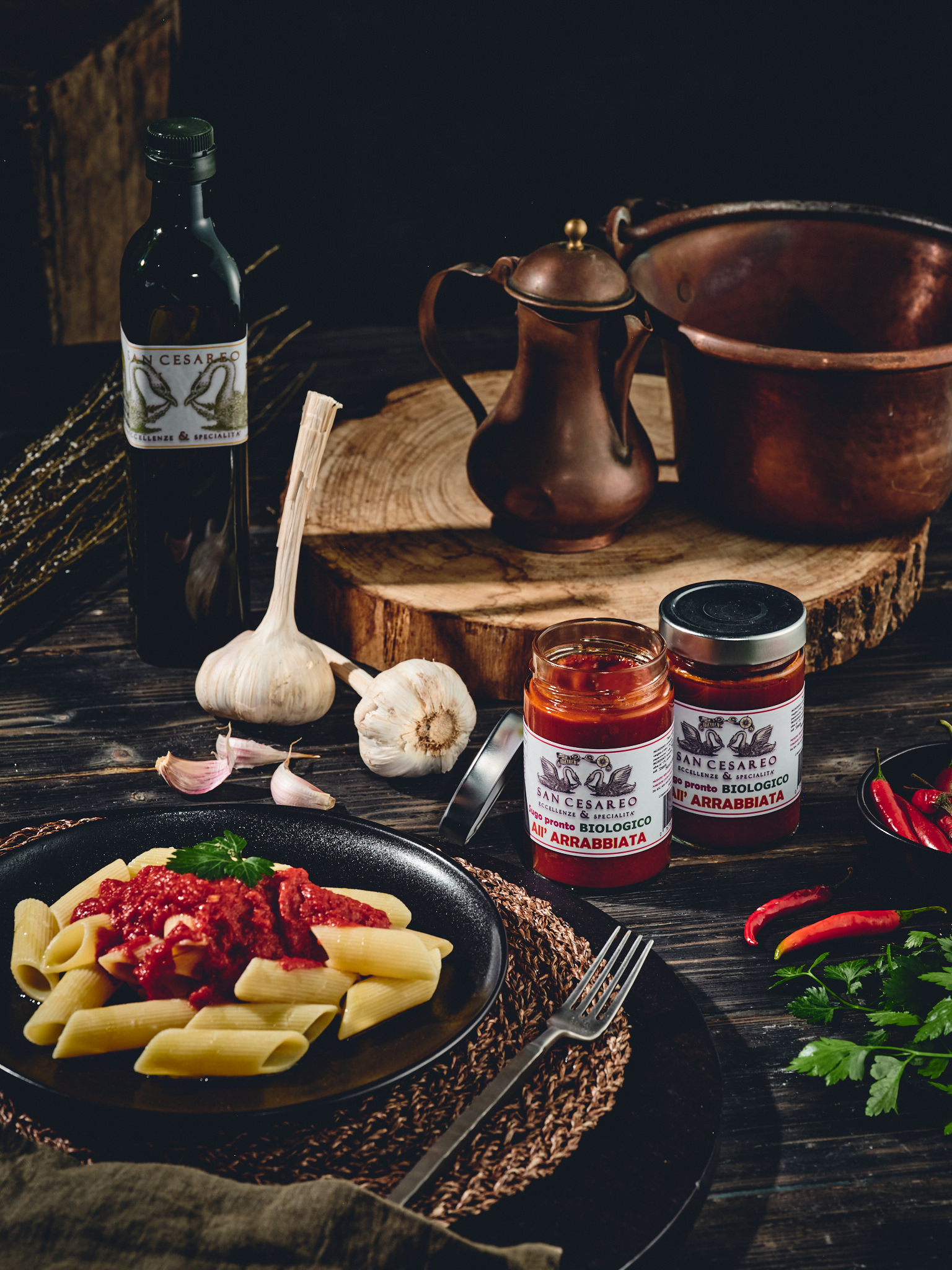
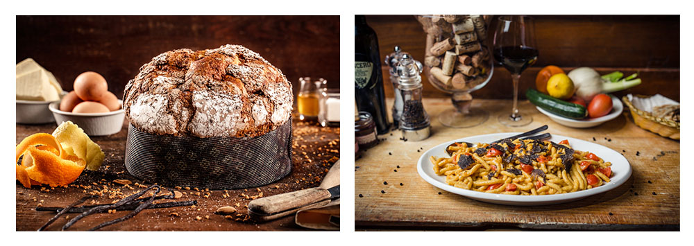
I use a lot of wooden boards, bright, dark, and of various warm tones.
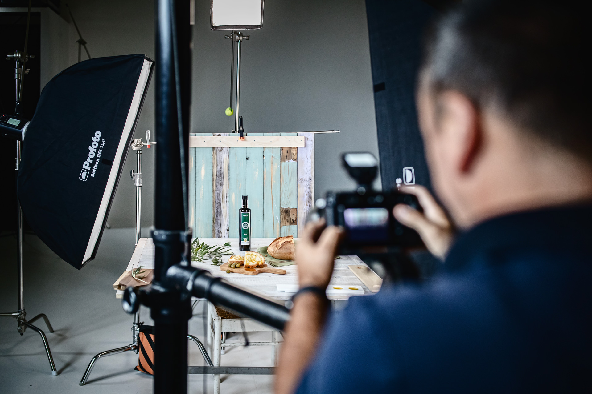
– The lighting scheme
It is well known that lighting a photographic set is the main feature that makes our photography epic. I often had some problems during the lighting schemes installation. Reflections, lights, and shadows must be dosed well, incorrect positioning could give at the scene a wrong message.
Soft light
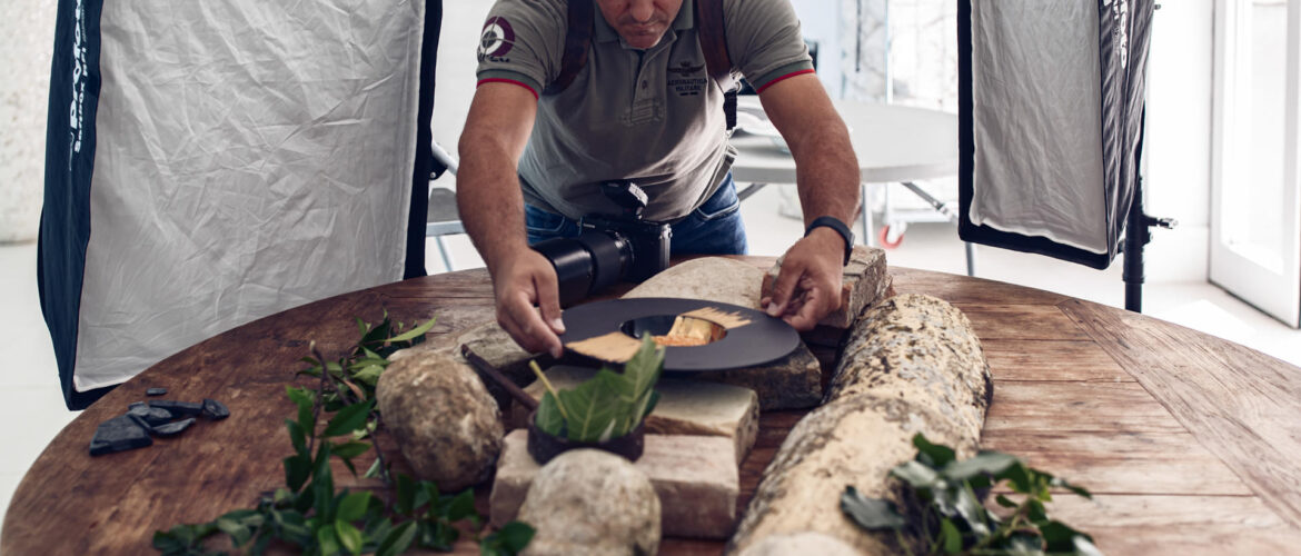
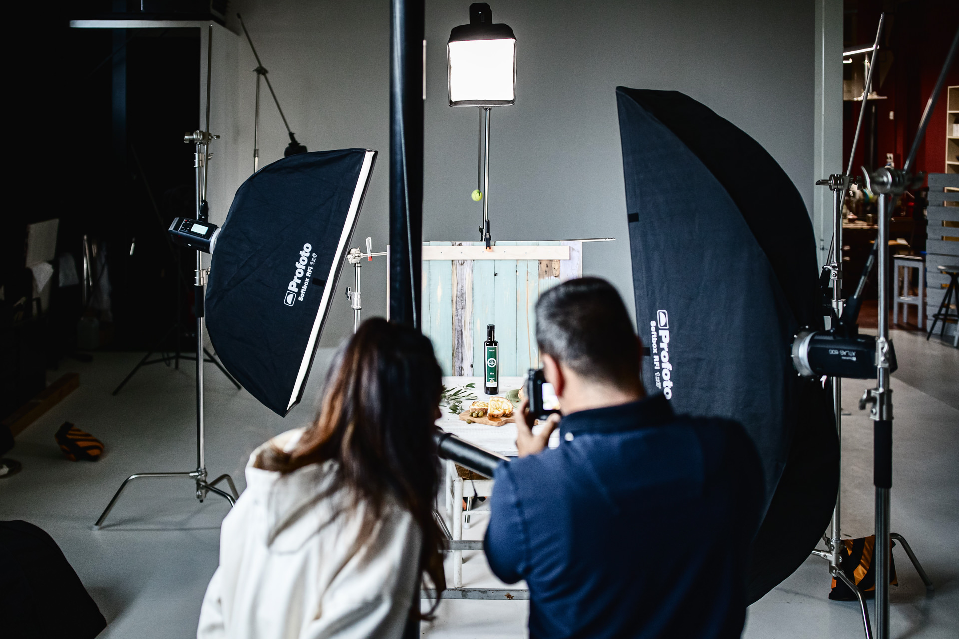
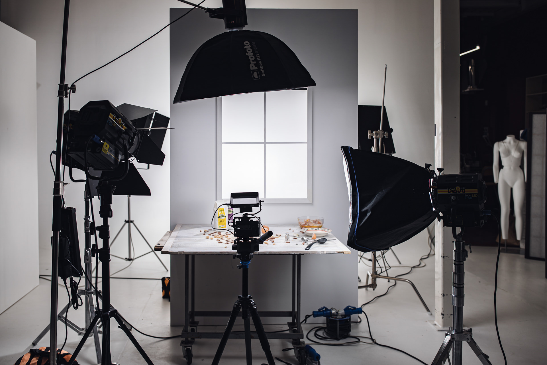
This light is generated by a large light source and especially very close to the subject. For example, with large and rectangular Profoto 4×6 or Profoto 2×3 softboxes we can obtain soft lights with natural reflections on the reflective elements (bottles, plates, glasses, cans). When we have no reflective surfaces we can use Octabox Profoto Octa 3′ or Profoto Octa 4′, very comfortable and manageable. I also use the XXXX and XXXX reflective panels a lot, which together with the XXXX and XXXX flags create interesting light and shadow effects on our backdrops. We can create delicate images with diffuse shadows, sometimes without shadows … less three- dimensional but pleasant photos.
It is suitable for giving the image delicacy and softness. Very interesting is the use of backdrops with pastel colors, especially with card stock and other similar materials, obviously white is also right. Very good light with high and voluminous props, whose shadows would create bad effects. We must use this softness when shadows mustn’t be part of the scene.
Hard Light
We get hard light, of course, with small light sources and especially far from the subject. I’m used to working with softbox like Profoto 1×1.3′, Profoto 1×3′ or direct light with Profoto 7” Grid, in this way hard lights will make our image and the backdrop really amazing. Much used with not too high elements, clear shadows are obtained which create a harmonious three-dimensionality. When I shooting from above, I often use hard light because it can generate a detachment between the subjects and the backdrop. Any type of backdrop can be used.
– Surfaces and materials
Oh God, won’t it be easy to explain this part?
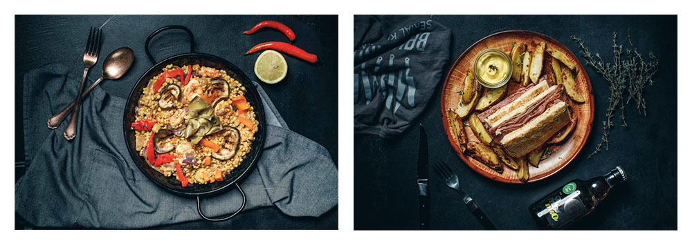
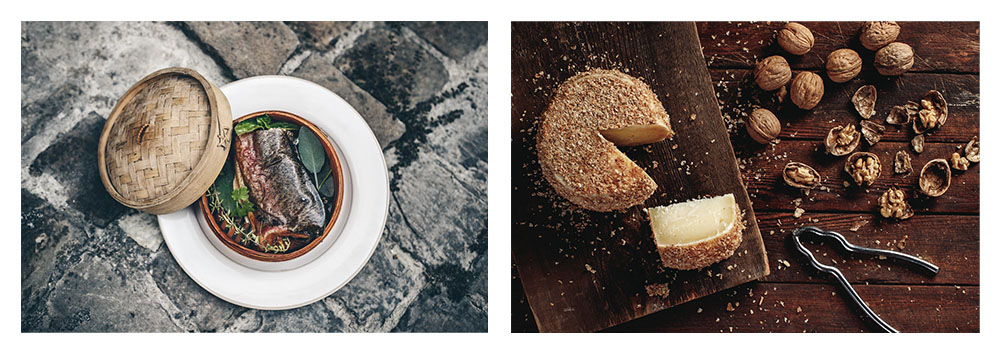
Obviously I will not be able to talk about everything, there are thousands of details to describe, I will put some photos to give you some examples!
Let’s start with the easier thing, the most used and most functional backgrounds are undoubtedly the matte ones. The shadows are very uniform and pleasant, they don’t reflect strobe or continuous lights and they work well with all foods and light schemes.
With shiny surfaces it is very difficult to manage the lights, even if, We could use them in specific cases when we need special effects and amazing reflections.
Now let’s go to choose our ideal texture.
Textured Surfaces
Let’s start by saying that the structured surfaces give the image a more traditional and country
look, so it is better to use these surfaces when the food is intended for a more “raw” audience who likes fullness! When the quantity wins on the quality, foodporn! I’m used to choosing them when we have to talk about homemade food and not at the restaurant (even if it depends on the type of restaurant), like give the feeling of a grandmother’s table!
I use wood a lot, You can make surfaces with boards with beautiful veins or painted panels with textured paints. In addition to being easy to handle, wood can be painted in any color we want. Other materials of this type can be stones, rough tiles, get creased fabrics, or special papers.
Smoot Surfaces
With elegant or graphic foods I usually prefer smooth surfaces, they transmit cleanliness, professional style, and precision. Better if of solid colors but We can use them in all versions. Very suitable for gourmet cooking and for important chefs.
The surfaces that we can use are a lot.
I often use painted wooden panels, they are comfortable, robust, and easy to handle. We can paint them several times with every type of set that we have to do.
I also like ceramics but I find them too heavy, I use them however for their convenience in the presence of liquids.
Lately, I use laminate flooring a lot, I can clean them well. They are very light and, if necessary, we have the possibility of creating large surfaces.
Shiny surfaces
These backdrops are used a lot in cosmetics photography rather than food photography, plexiglass, glass, and ceramics.
We can take creative pictures but manage the light is not very easy.
Fabrics
The fabrics can be used either on the whole surface or in some places with napkins and dish towels. Using fabrics give a cool view to our photos, but they are often expensive and difficult to reuse in more than 2 or 3 environments, we risk always taking the same photos.
I choose to rent in specialized stores or borrow them from friends and relatives.
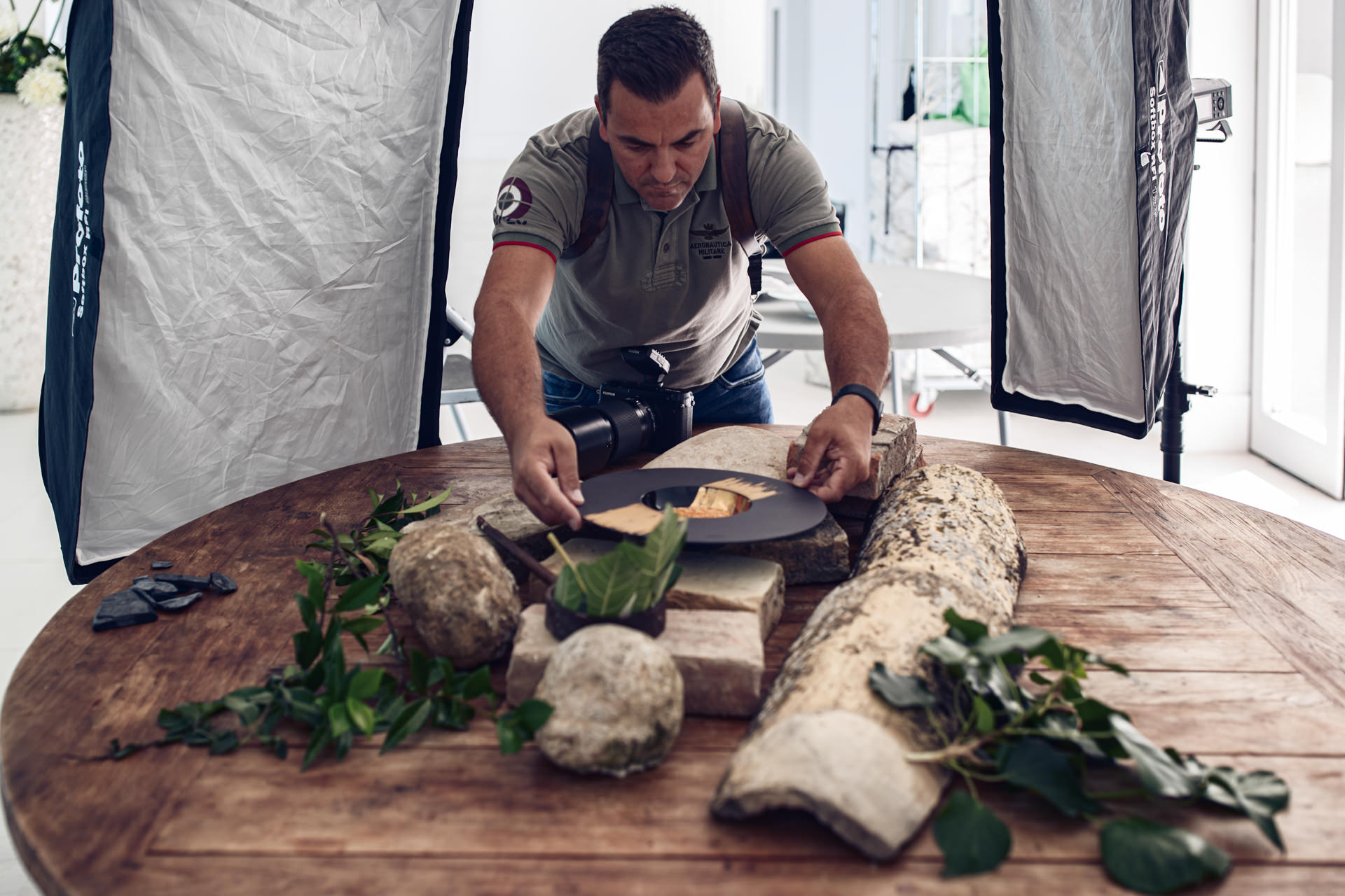
Props
we talked about almost all the types of backdrops to be used, now let’s talk about the additional scene elements, all those details that enhance and enrich our set.
There are many possibilities to combine these elements. If you are starting with food photography I believe that you have to take only a few things initially.
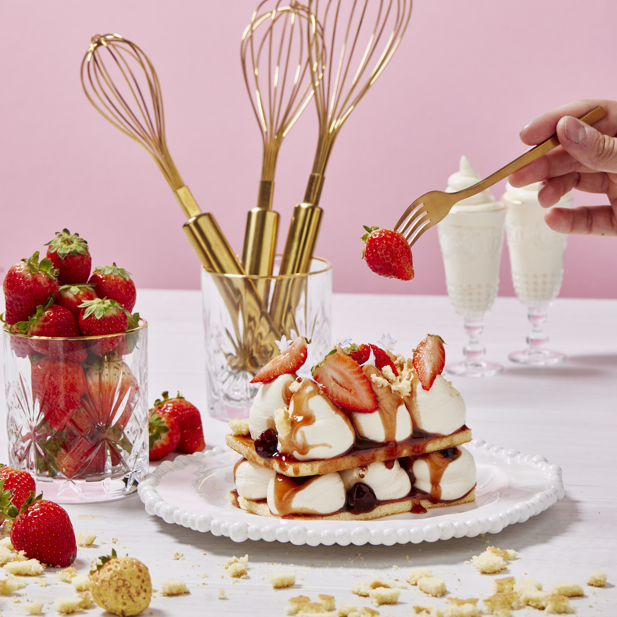
• Three or four types of tablecloths or kitchen cloths, choose them with neutral colors and textures with not too bright colors, so you can use them in multiple sets without giving too much attention.
• Forks, knives, and spoons, we will need it. You have to choose them based on the style of food photography you have. Shiny when you want to give a bright and commercial style, pleasant the effect of reflected light that makes them totally white. Matte when your style is more vintage or you do dark photography, not having reflections they are very simple to illuminate and positional on the set.
Initially, you can purchase a few pieces, even if not paired.
•Fairly neutral plates and saucers, both opaque and glossy. I usually use those of my customers, the dish is often part of the food itself, so it is better to choose the chef who cooked it. Just get plates and saucers to add items like bread, spices, and ingredients.
•Three or four types of glasses, preferably in pairs. Meal, aperitif, and dessert glasses.
•Cups and mugs. I use them very often, especially blurred in the edges of the set, they make up the setting and do not catch too much attention. Even these would take two or three pairs with not too bright colors.
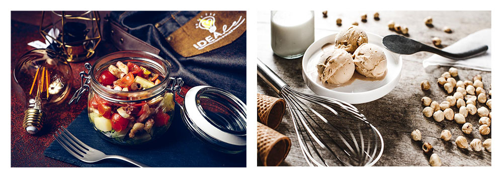
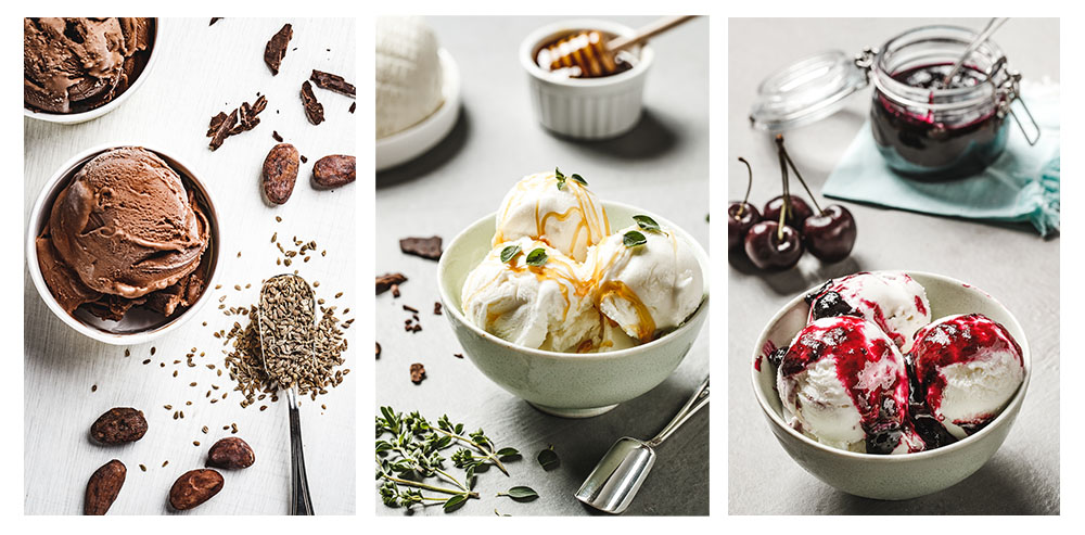
•Pinch bowls and small glass jars, I use them a lot to add sauces and spices. Essential elements for filling empty areas in the set. I recommend taking different types, they are very useful.
•Cutting boards, slate tops, and the like, often used when the set talk about food preparations. Usually we use at most only one in a set, just a few pieces initially.
•Cookware and kitchen accessories, I prefer slightly smaller ones that work very well. Difficult to use big ones, sometimes we have to crop them out of the frame.
Tips for beginners
Taking pictures of food is not easy, you need a predisposition to be a food stylist. I recommend you to start with very simple sets, only one light point and very few elements in the set. Shooting from above is often better, easier to direct the light.
Testing and experimenting is the best way to approach food photography, you have to photograph homemade food, breakfast, lunch, dinner, and dessert. Taking photos with your mobile phone, at home and in the restaurant, an excellent exercise to learn the composition and combination of colors.
You can use tables and tablecloths as backdrops, this is the secret to start better, we don’t have to complicate things too much. First we need to understand the style, colors, and materials that we like, then let’s move on to buying or self-building the backdrops that are most suitable for us. There are no tricks, there are many rules to follow!
Tips for experts
If you are a beginner and you want to improve your level, there are some basic steps to do. The first tip is to work with art directors and food stylists, absolutely necessary to extend your horizons and to find new points of view. I have often changed my style with their positive contamination.
The second piece of advice is to study new light schemes, use both soft and hard light, flags, and reflective panels. In this situation the photographer really makes the difference.
The third tip is to understand what is behind the food, know what we are photographing. The photos must reach concrete results, they must convey the message the customer requires. It is useless to take amazing photos if they don’t work, we must take worthwhile photos!
Conclusion
WoW, we have come to the end!
I swear to you guys, this article squeezed me like a lemon (let’s stay on food).
If you’ve come to read this far it means that you understand that in food photography there are many tips and rules to follow but few tricks!
To choose the backgrounds and props for the set you have to know the colors, the light, and your style must be very strong and clear.
I believe that you must start to take pictures now, I believe that you must show me what can you do.
Wilson Santinelli